Tuesday, June 9, 2009

Yay for days off

Yep... I took a day off today. It's a Use or Lose situation at my work, so I'm working on the using them all up. :)

It's so nice. I finally made it to the post office - I've had a box of 40-some cards that was destined for the troops sitting on my floor for almost a month.

I picked up 11 more Copics at a local store. :)

I also made some cards that I've photographed and am actually about to post here. I know, I'm in shock too.

So after I put the new Copics into the basket, I was flipping through my cardstock to find a color combo that inspired me. I pulled Old Olive, So Saffron and then decided that Groovy Guava (one of last year's In Colors) would be a great pairing. It's such a summer color combo.

One of the things I knew I needed to make was a graduation card and following the inspiration of Joan B (who's in my blog roll), I used the stars from Papertrey's Anniversary set, Everyday Classics.

My first card looked so great, I had to do another - this time a birthday card. I already have a Christmas order - an assortment of cards to be given to a coworker's mother. So this card's going into that pile.

Stamps: PTI - Everyday Classics. Paper: So Saffron, Old Olive, Groovy Guava, Vintage Cream, dp. Ink: So Saffron, Old Olive, Groovy Guava. Accessories: dimensionals, quickie glue pen, glitter, spiral punch.

Hope everyone's week is going well,

Sunday, May 31, 2009

On the other side of the wedding

So... my brother got married last weekend and it was beautiful, I cried (because I'm sappy like that) and it was all-around fun.

I scrambled to be ready and now I'm scrambling to get back into the swing of things. And at the end of next week...

SCHOOL ENDS. *tries not to run screaming*

On the bright side, I went shopping with my best friend Erica this weekend and on a whim I went into Pottery Barn to see if I could find anything that would work for my Copic storage. Not that I have anything against the plastic containers, but I wanted something cute.

And I found this:

The basket - the markers are mine.

I tried to find a picture of it on the Pottery Barn website and it's only sold in the stores (I got mine on sale.) Because it's designed for carrying glasses or bottles, there's a wire and then nothing separating the sections - NOT good for markers. I cut up a piece of backing from an SU dp pack and created dividers. Now the Copics stay in place.

And I have room for more markers - when I expand my collection.

I wanted to show off.

Wishing everyone a great week,


Saturday, May 16, 2009

Pictures

I promised pictures of the bag and card that I'll be giving to my sister-in-law-to-be tonight. Before I went to bed, I packaged everything up nicely, wrote in the card and sealed the envelope.

Before I took a picture of the card. *HeadtoDesk*

I'm such an idiot sometimes.

Anywho, here's the bag - plain white from Michaels. I added the satin ribbons at the top and bottom of the bag and they go all the way around the bag. If you can't tell, the wedding colors are chocolate brown and sage/moss green.

The focal point of the bag is cut out with square Nesties.

I've had this stamp set for over a year and it's a little tricky to use for cards. But it's perfect for a bachelorette party! The tissue paper is stamped with the bra and undies too - as is the card. It all goes together. Which is surprising - I generally don't do this.
Stamps: Gina K/Langley Boy - Thanks for Your Support. Paper: PTI Dark Chocolate and Select White, SU Mellow Moss. Ink: PTI Dark Chocolate, SU Mellow Moss marker. Accessories: Square Nesties, ribbon, red line tape, Stickles, bag, tissue paper.

As I think I mentioned last night during my squealing post - did I mention I got my PTI Anniversary set? - this weekend is VSN over at Splitcoast.

I couldn't resist using my new set for the first challenge - Double up - make 2 identical cards. I had some Making Memories ribbon out on my table from earlier in the week and I realized that it was very close to PTI's Berry Sorbet in color. And I was off.

Stamps: PTI - Everyday Classics. Paper: PTI - Berry Sorbet, Spring Rain, Craft, Vintage Cream. Ink: Spring Rain, Berry Sorbet. Accessories: dimensionals, ribbon.

The 3rd VSN challenge was to use black, white and red - and ONLY black white and red. Do you realize how many shades of red there are????? I was nearly pulling my hair out trying to find a red dp that would be okay with PTI's Pure Poppy. I settled on using some Real Red dp that I got last year.

Stamps: PTI - Quilter's Sampler and Additions. Paper: PTI - Select White, Pure Poppy, SU - Basic Black. Ink: Palette Noir. Accessories: dimensionals, brads, Sakura Glitter pen, R29 Copic.

EEK! I just noticed the time and I have about 10 minutes to get to my hair appointment.

Wishing everyone a great weekend!

Friday, May 15, 2009

*Running by squealing... with a cd case in my hands*

Yep, I FINALLY got my Papertrey anniversary set in the mail today. It's all assembled and ready to be inked.

Speaking of inking... it's Virtual Stamping Night at Splitcoast. If you're looking for some inspiration or just want to make a bunch of cards (there are 16 challenges) head on over. It's a blast!

Pictures coming soon!

Wednesday, May 13, 2009

Would you believe...

I've been kidnapped by aliens?

No?

Okay, the truth: Casa Sara's a bit nutty. Well, I'm a bit nutty too, but I've always been that way.

Nutty Reason #1: I have a lot of work due next week. Lesson plans for the month of June, grocery list for special days, craft supplies I need, rules for games - all due. EEEK.

Nutty Reason #2: As if Nutty Reason #1 wasn't enough - my brother's getting married on the 23rd. Which means wedding stuff on top work stuff and making sure Casa Sara's up to snuff when the family rolls in.

I definitely need to get a picture of the gift bag, tissue paper and card for the bachelorette present. I think it's adorable and needs to be posted.

So... that's where I've been. And where I'll be until after Memorial Day.

Praying for my sanity,

Friday, May 1, 2009

An Inspiration Challenge

I generally don't do the IC challenges on Splitcoast, but today's challenge was interesting. It was your choice of Faviana prom dresses.

After sorting through 10 pages of dresses, I found this one: Style 6222

The warm colors really caught my attention, the gold detail at the bottom is pretty. I want this dress... if only I were small enough to fit in it.

Anywho, back to the card. To get the shimmer of the actual dress, I spritzed my Really Rust cs with Sugar Cookie Glimmer Mist (only because the Peach Delight stuff was being stupid and not spraying.)

The images and sentiment come from PTI's first anniversary set Simple Little Things. They're stamped on vellum with Versamark ink and embossed with gold ep. I kinda wish I had PTI's Damask set - that would have been PERFECT!

I added a simple knotted ribbon as an accent.

And it didn't take me forever either. I'm proud of myself.

Stamps: PTI - Simple Little Things. Paper: Really Rust, Ruby Red, vellum. Ink: Versamark. Accessories: Glimmer Mist, gold ep, ribbon, corner rounder punch, Mono Multi.

In other news, I've found a home for some of my old cards! Keri Sereika (Sereikastamper on SCS) has a hubby in the military and she's running a card drive for cards to send to the troops. Well, since I'm sitting on a LOT of cards with blank insides (which is what is asked for), I'm going to send off a bundle soon.

Hoping everyone stays healthy and that H1N1 flu stuff stays far away (preferably disappears altogether)

Sunday, April 26, 2009

Another Sunday card

It's not a Featured Stamper card though. I went through the gallery and didn't find a card that I wanted to try to CASE.

I went shopping yesterday. It was to get a present for my best friend who has a birthday on Friday - which I did get - but I wound up getting a lot of stuff for myself too.

I found 3 more Copics that I "needed" (aka - didn't have, were on sale and not too dark in color), I bought a non-stick craft sheet, a Tim Holtz ink spreader thingy, refill pads for that, some Distress Embossing ink, Distress Embossing Powder, 2 colors of Liquid Pearls, 2 Tim Holtz mini masks, and an Inkadinkado clear stamp set.

So... I wanted to ink up my new set. My fairy is stamped in Palette Noir and colored in with Copics. I then added some glitter on her wings and the trail. It's very sparkley in real life. She's cut out and layered with Oval Nestabilities.

The background is a piece of Bashful Blue dp that I got in a 6"x6" as a SU hostess gift last year. I ran it through my Cuttlebug and then made it visible by dragging my Certainly Celery pad over it.

The sentiment is from Stamping Bella.

Stamps: Inkadinkado - Beautiful Fairies, Stamping Bella - Thank You Fairy Much. Paper: Bashful Blue cs and dp, Certainly Celery, Select White. Ink: Palette Noir, Certainly Celery. Accessories: Copics, Nestabilities, glitter, dimensionals, ribbon, Cuttlebug, paper piercer.

I have the urge to make some more cards, so hopefully it'll be a 2 post day.

Thursday, April 23, 2009

Another card... finally

Today's Ways to Use it Challenge (WT) on SCS was to use white - ALL white.

At first thought, it was a little freaky. I know all white cards are classy and sophisticated, but I want COLOR! Following Julia's (the hostess) example, I grabbed my Glimmer Mist. My quilt and the Primas are sprayed with Sherbet and Spring Violet.

I'm in love with the Quilters Sampler stamp sets by Papertrey. It's so much fun to make your own quilts with paper. To add a little more variety in my quilt blocks, I colored parts of them in with my Copics.

Stamps: PTI - Quilters Sampler. Paper: Select White. Ink: Palette Noir. Accessories: Glimmer Mist, dimensionals, Copics, Primas, lace, brads.

Wishing everyone a wonderful day,

Monday, April 13, 2009

My Apologies

I said that I'd post the blog candy winner at midnight EDT - as in 8 hours ago, but I've been sick.

Like haven't gotten out of bed except for bathroom trips and to go see the doctor to find out I have strep - sick.

So, like the title says, my apologies that this is late.

After plugging all the important information into random.org, I came up with my blog candy winner:

#5

Kim P.

Congrats!

Kim, if you could email your address to me at deipara@yahoo.com with the words Blog Candy in the subject line, I'll get your goodies out to you as soon as I can!

Thanks for playing everyone!

Tuesday, April 7, 2009

Another Tuesday Color Challenge

***Don't forget! My blog candy is still open - if you want to enter, please comment on the Sunday April 5th post. You have until Sunday/Monday to enter!****

So, onto the business at hand - today's Color Challenge. Which surprisingly didn't contain any In Colors, greens or pinks - Emily the hostess loves those colors. The colors for today are/were: Bashful Blue, So Saffron, and Close to Cocoa.

I started off with the cardstock and then hopped over to where I've stashed my dp. Thankfully spring break at daycare's been good to me (so far) and I haven't lost all my brain cells (yet.) So I remembered I still have a stash of Le Jardin dp from SU - and that 2 of the colors in the paper are So Saffron and Bashful Blue.

I then remembered one of the PTI stamp sets I fell in love with as soon as I saw it - Quilter's Sampler. I think I like it so much because I can't sew a straight stitch on a machine, so this is the easy way to create a cute quilt without it looking like a 5 year old wacked out on sugar made it.

The quilt squares are stamped in Palette Dark Chocolate on the dp and cut out. I colored in parts of the blocks with Copics to add more depth.

The sentiment is also on another piece of Le Jardin dp and it's also from the Quilter's Sampler set.

Stamps: PTI - Quilter's Sampler. Paper: Bashful Blue, So Saffron, Close to Cocoa, Vintage Cream, Le Jardin dp. Ink: Palette Dark Chocolate (PTI). Accessories: buttons, corner rounder punch, Copics, dimensionals.

Here's hoping that your week is nice!

Sunday, April 5, 2009

Blog Candy for 10K (and some cards)

I've been doing better about actually making cards over the past week. Maybe not getting them posted here right away, but the creative juices have been flowing.

Behind Door #1, is the card that kinda came out of the Inspiration Challenge. I say kinda because while I loved the intricate patterns of the French Bull plates, I couldn't find a pattern I could do justice. This happens a lot for me.
The background image is the vine from PTI's With Sympathy and it's stamped in Palette Noir ink. I highlighted some of the leaves with a white Prismacolor pencil.

The image is also from With Sympathy and is stamped in Gable Green and Lavender Lace inks on Cryogen white cardstock (Shimmer.) The sentiment is from Out on a Limb Sentiments (also PTI) and is stamped in Palette Noir.


Stamps: PTI - Out on a Limb Sentiments, With Sympathy. Paper: Cryogen White, Pixie Pink, Gable Green, Lavender Lace. Ink: Palette Noir, Gable Green, Lavender Lace. Accessories: brads, ribbon, white Prismacolor pencil, scalloped rectangle Nestabilities, ticket corner punch, dimensionals.


Behind Door #2 is today's FS card. The card is chose to CASE is this one.

Stamps: MFT - Boho Blossoms. Paper: Old Olive, River Rock, Real Red, Basic Gray, Whisper White, Basic Grey Scarlet's Letter dp. Ink: Old Olive, River Rock. Accessories: corner rounder punch, brads, rhinestones, dimensionals.

*******************************************************************************
Now onto what probably drew you to this post: the BLOG CANDY. I've finally reached 10K hits on my counter and I figured it was time to celebrate. I haven't given away blog candy since May of last year, so I've had some time to save up the goodies.

A 3 pack of 4x6 pine frames from Ikea
Autumn Leaves Flourishes clear stamp set
Making Memories shimmer brads
Making Memories eyelets (grass stains, dusk and manilla)
Glimmer Mist (Peach Delight)
A frame embellishment kit
7 Gypsies handbag kit
We R Memory Keepers metal alphabet set
1 yard red gingham ribbon
Doodlebug Dotlets (copper and gunmetal)
Primas
Buttons
Rhinestones

As I look through my list, I realize that there are a lot of embellishments. Which makes me wonder...

What is your favorite (go-to) embellishment for cards, scrapbooks, altered items, etc?

Please answer the question as a comment on this blog post and I will randomly select a winner at Midnight ET April 12/13.

Good Luck!

Thursday, April 2, 2009

Foiled Again

So today's WT challenge was all about using foil on your cards: foiled paper, kitchen foil, etc.

I happened to find some Karen Foster metal sheets at my LSS on clearance a few years ago and thought it was a perfect choice. They're self-adhesive, so it makes it even better.

So I made my card.
Stamps: PTI - Out on a Limb, Out on a Limb Sentiments. Paper: Sweet Blush, Berry Sorbet, Select White, Karen Foster metal sheet. Ink: PTI - Berry Sorbet, Dark Chocolate; SU - Brilliant Blue. Accessories: dimensionals, classic rectangle Nestabilities, buttons.

And my card is driving me nuts.

**warning: rant about the flaws and a pity party to commence**

Nothing on my card is straight, the buttons are an "embellishment opportunity" (aka - I botched something and needed a way to hide it) and I had a fight with my Cuttlebug over embossing my cut out layers.

*sigh*

It's a nice card, but it's days like this that make me question my desire to join a design team. I don't feel like I'm consistent in my quality.

I'm just having one of those days - and it stinks.

Hoping your creative day is better than mine,

Wednesday, April 1, 2009

A new temptation

No, I didn't buy anything.

But I've been introduced by my friend Michelle Redman over on SCS to a new way of stamping: DIGI-STAMPING.

It's an image you download and you print off in your printer.

Oh, what a dangerous world this could be.

Michelle directed me over to a blog by a man named Dustin Pike - he draws the cutest dragons for his company Mooseberry Graphics. He also had some freebie digi-stamps on his blog - the dragons are absolutely adorable and since they're free, I couldn't resist. :)

It's a Sketch Challenge day at SCS and the sketch isn't bad at all.

Since I've done this lead up into the dragons and it's incredibly windy here today, I figured it was fitting that I use the dragon flying the kite.

He's colored in with Copics, highlighted with a white Prismacolor pencil, and sparkled with some Crystal Stickles.
Stamps: Mooseberry Graphics - digi stamp Fly Kite. Paper: Old Olive, River Rock, Select White, Pumpkin Pie dp. Ink: printer ink. Accessories: Copics, white Prismacolor, stickles, brads, ticket corner punch, dimensionals.

Wishing for warmer weather,

Sunday, March 29, 2009

Card Catch-up

I figured it was time to show off the 2 cards I've made this week.

The first card is actually from Tuesday. It's for the SCS Color Challenge of Kiwi Kiss (I used Old Olive), Baja Breeze (I used Sage Shadow) and Pretty in Pink.

Since I am horrible about birthdays, I figured I needed at least 1 belated birthday card in my stash.

Image is stamped in Palette Noir and colored in with Prismacolor pencils and baby oil. Her jammies are paper pieced with Pretty in Pink dp. The sentiment is stamped in Sage Shadow ink and punched out with a 1 1/4" circle punch.

The background is a piece of Old Olive cardstock that I laid a Tim Holtz mask over and sponged with Old Olive ink. I think it looks pretty cool.
Stamps: MFT - Here's the Scoop. Paper: Sage Shadow, Old Olive, Pretty in Pink, PTI Select White. Ink: Palette Noir, Old Olive, Sage Shadow. Accessories: Prismacolor pencils, baby oil, stickles, ribbon, Tim Holtz mask, 1 1/4" and 1 3/8" circle punches, dimensionals, button.

And then there's today's card. FS112.

Here's the card I CASEd: http://www.splitcoaststampers.com/gallery/photo/1188266

Changes:
I added a card base (I didn't want the Copic bleed-through showing)
Colors
Ribbon placement
No sentiment
Used a scalloped oval nestability as a mask

*Useful information if you choose to do something like this masked image*
My mask is the "negative" image from the nestability (the frame you get after you punch out the oval.) It was also notebook paper so I didn't get gaps in my stamped image. Copics bleed through this VERY quickly, so keep your marker light when you're working around the edges. Make sure you're able to remove your mask when you're done (personal experience on this one.)

I think I might be getting better with my Copics. Which is good.
Stamps: MFT - Can Ya Dig It? Paper: PTI - Spring Moss, Select White. Ink: Palette Noir, Ripe Avocado. Accessories: Copics, nestability, ribbon, dimensionals, white Prismacolor pencil.

Here's to a week that hopefully brings spring,

Wednesday, March 25, 2009

The Slippery Slope

Once I started buying again...

I won't say I can't stop - because I CAN. I just don't have the will or want to stop right now.

I'm trying, but it's not easy.

My LSS is now selling Glimmer Mist.

I found out because I was there asking for donations for work - my kids (my group) love playing with patterned paper and stickers and all that fun stuff.

I'm thinking of having an Ongoing Scrapbook for our summer. Have a table with scrapbook items out and when we get new pictures of a trip (or just regular day) let the kids create the page - and journal it.


***edited to add***

I just looked at my counter and I have less than 100 hits before I'm at 10,000! Blog Candy when I reach 10K.

Saturday, March 21, 2009

An Early FS

So... the Featured Stamper was posted early on SCS. Which is great, especially since I was in the mood to stamp.

Today's Featured Stamper is...

Beate.

Which is fabulous because she's one of the rock stars of Splitcoast. It's surprising that she hasn't been chosen before.

It's scary (in a way) because she's ONE OF THE ROCK STARS OF SPLITCOAST. How on earth do you CASE Beate - and make it look good?

Well, it's not nearly as rough as I thought it would be - or a rough as finding a card in her gallery that doesn't have more than 20 Favorites. (I told you she's a rock star.) I settled for a card that had about 25 Favorites.

Here's Beate's Card.

You have to change at least 2 things - rules of the Featured Stamper Challenge. I changed:

Stamp
Colors
Size of the card - mine is 5.25" square
Left off the circles
No paper piercing
Stamps: Rubbernecker - Rose. Paper: Sage Shadow, Basic Gray, Basic Black, Basic Grey Marrakesh dp, Stampers Select White. Ink: Palette Noir. Accessories: Prismacolor pencils, dimensionals, ribbon, brads.

I'm excited to see the start of my daffodils and tulips in front of the house - it means spring's definitely on its way.

Wishing everyone a great rest of the weekend!

Saturday, March 14, 2009

Shopping Therapy

I know it's been a while since I've posted - I'm creating, just not taking pictures of stuff.

Plus life's gone wacko again, so I've been laying low.

The kids at work were CRAZY this week - Wednesday, Thursday and Friday especially. It's the full moon at work.

So... armed with a 20% entire purchase coupon from Michael's, I did a little shopping therapy.

Yeah, making it past Easter without a purchase didn't fly.

It was a Tim Holtz day: one of his stamp sets, some Distress Stickles, the clockwork mask set, 2 jars of Distress Crackle Paint, and a set of Fragments.

Oh, and some Prima gem stickers.

I'm feeling a little guilty, because I cheated on the spending ban again.

But some time in stamping therapy (with my new goodies) with wash that guilt right away.

Thursday, February 26, 2009

Frugal Stamper

Today's WT challenge was to be frugal and find things that help us save. I think Julia was talking about embellishments, but I tried my best for my entire card.

Items I didn't buy:
Ribbon - it was given to me by my boss. She knows I make cards and apparently she's been saving ribbon for me.
Felt Flower - it was part of my reveal gift for the VSN Secret Sisters last August. It's one of the things I dug up when I was cleaning the Dungeon on Sunday.
Damask background - I won a contest on the Flourishes forum on SCS a while back. I don't think it's what I asked for, but I use it A LOT.
Dimensionals - part of a package from a CCRAKer.

Imogen the Fairy is stamped in Palette Noir on PTI Cream. She's colored in with Copics (very carefully, I had bleeding of both the markers and the ink.) The background is another piece of Cream, embossed in clear and sponged with Pure Poppy ink and Fired Brick Distress ink.

**NOTE: As you can tell, Palette inks (Pure Poppy is one) stick to embossing powder. This was a bad move on my part and this isn't what I wanted the background to look like.**

Stamps: Stamping Bella - Imogen the Fairy; Flourishes - Damask. Paper: Real Red, PTI Cream. Ink: Versamark, Palette Noir, Pure Poppy, Fired Brick DI. Accessories: Copics, clear ep, dimensionals, ribbon, felt flower.

It's pouring outside. I'm hoping that we're not about to wash away.

Wishing everyone a dry few days.

Tuesday, February 24, 2009

My Copics are here!

Yay for super-fast shipping!

My 13 new markers, refill for my colorless blender and a new pair of Dahle scissors (which were free with my order) all arrived today.

I'm so happy.

I've already filled in the spots on my Copic marker chart and I need to get the marker cases and slide them into their spots.

Monday, February 23, 2009

A New Improved Dungeon **Lots of pictures**

First off, I'd like to say that confession is good for the soul (yesterday's post.) I felt I needed to be honest with myself and make it clear to anyone who reads the blog (and possibly cares) that I'm not perfect when it comes to things like not spending $. I'm trying to save up, but the urges get to you sometimes.

On Saturday I mentioned that I needed to clean the Dungeon - my stamping area in the basement. It was a mess and desperately needed to be organized. I also promised pictures.

I headed down there yesterday afternoon with my handy-dandy iPod and set off to work. (I had laundry going as well, so multi-tasking was the name of the game yesterday.)

Two and a half hours later, it's not perfect, but it's a whole lot better than it was.

Before pictures:
A random box I brought downstairs and never cleaned out (I actually stacked stuff on top of it.) A crate of extra SU cardstock and a pile of things to be altered.
Cart where I put my SU stamps.
The view down my table.
My dp rack and area around it.
Papertrey cardstock (and surrounding mess.)
Table - closest to my ink caddy.
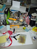
Table - where I sit and work.
Table - dumping ground.

Middle/After Pictures:
The box is gone! (the rest of that stuff isn't mine.)
Yeah, I know, the crate looks messier than before. I moved all my dp into one place and I had more alterables to store.
View down the table. Yeah, it's worse - I had to put stuff someplace in order to sort it.
The cleaned off dp rack and new storage.
Hey, you can see my box of Papertrey cardstock! (which will be replaced by a file crate and files)
Another shot of the messy tabletop. But hey, we're making progress! Final status of the cart - Cuttlebug alphabets, plates and Nestabilities are stored in that purple storage caddy on top. View down the table. I figured out that the tray is perfect for the rolls of ribbon I've had floating around. Messy tabletop - not so messy now!
A clean tabletop!